The Elements + Principles of Design
The elements and principles of design are the foundational building blocks used to create a visual work.
The elements of design are the A, B, C's that are put together by any artist or designer to create an image or object.
The grammar of how these elements are used by anyone creating a visual image or object.
Good or bad, all visual works will contain most of these elements, the nine elements of design.
The principles of design can be thought of as how an artist or designer, or anyone making something visual, makes use of them.
How we manipulate the elements and principles of design, or, how we employ them, creates an impression that an audience will interpret.
These are the artist and designers writing tools of how they express an idea, if you will.
How we apply the principles of design determines how successful we are in creating a work of art.
THE ELEMENTS OF VISUAL DESIGN
Line
Shape
Color
Volume, mass and form
Space
Texture
Value
Rhythm
Line
Shape
Color
Volume, mass and form
Space
Texture
Value
Rhythm
LINE
Line can be considered in two ways. The linear marks made with any mark making tool onto a ground or substrate. Line can also be implied -- the direction that implied between forms and the edge that is created when forms meet in space.
 |
| Vassily Kandinsky ink drawing on paper 1920's |
 |
| Tom Freidman Concentric Circles drawn into Ivory soap with human hair |


SHAPE
A shape is a self contained defined area of geometric or biomorphic organic form. A shape is a flat area that expresses two dimensions.


Henri Matisse
VOLUME + MASS + FORM
Constitutes the actual three dimensional area a form takes up. This thus expresses actual three dimensionality in space, or, the illusion of three dimensionality.


 |
| Donald Judd, Encapsulating Negative Space |
DIRECTION + MOVEMENT
All lines have direction - Horizontal, Vertical, Diagonal
Horizontal suggests calmness, stability and tranquillity. A horizon line.
Vertical gives a feeling of balance, formality, alertness and activity.
Diagonal direction suggests a faster speed of line.
But, remember, CONTEXT always adds to meaning!


SCALE
Scale is simply the relationship of a form occupying one shape to that of another.


SPACE
Space is the scale between objects.


It can also imply depth full space as in the illusion of three dimensionality. Linear perspective is a two dimensional drawing invention developed in the Renaissance for target practice and to understand the trajectory of cannon balls, visually suggests depth full space on a two dimensional plane.

TEXTURE
Texture is the surface quality of a shape - rough, smooth, soft hard glossy etc. Texture can be physically tactile as well as visually interpreted as having a certain feel.


COLOR
Also is also known as Hue
Primary Colors + R B Y
Secondary Colors + O G Violet (purple)
Local color - the actual color of things
Optical color - a suggested or express color of things


VALUE
Value is the lightness or darkness of a color.
We know Value as the shades of a color.
A value that is darker is known as a Tone.
Those that are lighter are known as Tints.


The Principles of Visual Design
Unity - Variety / harmonyBalance - symmetry / asymmetrical / radial / occult
Emphasis - Focal Point
Pattern
Visual Weight / visual speed
Contrast
Visual Movement / direction

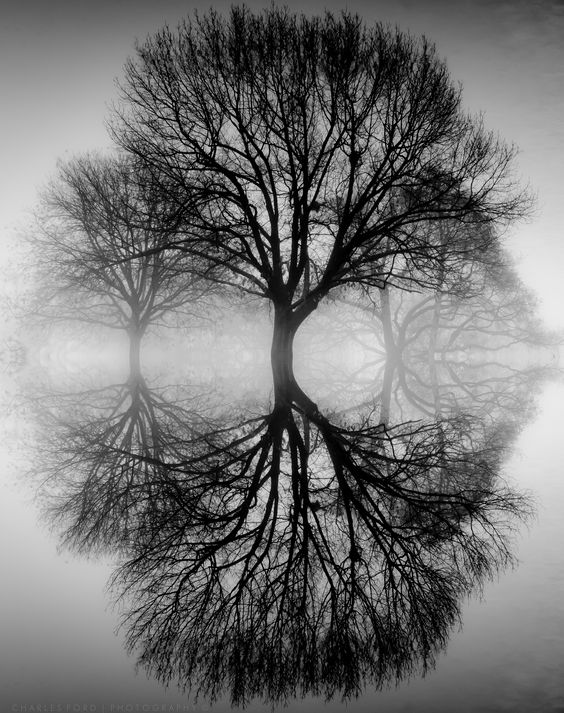
Bilateral Symmetry - horizontal axis
Radial symmetry - elements that are arranged around a central point

Domed Ocular (window) in architecture

a natural sea urchin
Emphasis is the part of the design that catches the viewer’s attention. It is the focal point. Usually the maker will make one area stand out by contrasting it with other areas. The area could be different in size, color, texture, shape, etc.
Movement is the path the viewer’s eye takes through the work of art, often to focal areas. Such movement can be directed along lines, edges, shape, and color within the work of art or design. Horizontal = passive Vertical = active Diagonal = emphasis speed
Christo - Running Fence 1976

Christo Running Fence Concept drawing
Pattern is the repeating of an object or symbol all over the work of art.

M.C. Escher - tessellation wood block print
Repetition works with pattern to make the work of art seem active. The repetition of elements of design creates unity within the work of art.Here, the examples are illustrating tessellation, having no negative space. All negative space is used up by the pictorial image figures

M.C. Escher - tessellation wood block print
Proportion is the feeling of unity created when all parts (sizes, amounts, or number) relate well with each other. When drawing the human, proportion can refer to the size of the head compared to the rest of the body.

 |
| Bilateral Symmetry - horizontal axis |
Radial symmetry - elements that are arranged around a central point
 |
| Domed Ocular (window) in architecture |
 |
| a natural sea urchin |
Emphasis is the part of the design that catches the viewer’s attention. It is the focal point. Usually the maker will make one area stand out by contrasting it with other areas. The area could be different in size, color, texture, shape, etc.
Movement is the path the viewer’s eye takes through the work of art, often to focal areas. Such movement can be directed along lines, edges, shape, and color within the work of art or design. Horizontal = passive Vertical = active Diagonal = emphasis speed
 |
| Christo - Running Fence 1976 |
 |
| Christo Running Fence Concept drawing |
Pattern is the repeating of an object or symbol all over the work of art.
 |
| M.C. Escher - tessellation wood block print |
Repetition works with pattern to make the work of art seem active. The repetition of elements of design creates unity within the work of art.
Here, the examples are illustrating tessellation, having no negative space. All negative space is used up by the pictorial image figures
 |
| M.C. Escher - tessellation wood block print |

 |
| René Magritte, The Listening Room, 1957 Surrealism |
Rhythm is created when one or more elements of design are used repeatedly (repetition) to create a feeling of organized movement. Rhythm creates a mood like music or dancing. To keep rhythm exciting and active, variety is essential.

Variety is the use of several elements of design to hold the viewer’s attention and to guide the viewer’s eye through and around the work of art. Variety offers difference in a creative work. These are all apples. Each one differs from the next, even in its own species. 
Unity is the feeling of harmony between all parts of the work of art, which creates a sense of completeness.
REPETITIONRepetition with variation is interesting, without variation repetition can become monotonous.
Without variety, five squares all the same can be taken in quickly and understood with a single glance.
When variation is introduced, the five squares, although similar, are much more interesting to look at and slow the viewer's attention down. The squares can no longer be absorbed accurately in a single glance. Each individual character, or the variation of each square, needs to be thoughtfully considered.
If you wish to create interest, any repeating element should include a degree of variation.
CONTRASTContrast is the juxtaposition of opposing elements, i.e. opposite colors on the color wheel - red / green, blue / orange etc. Contrast in tone or value - light / dark. Contrast in direction - horizontal / vertical. Too much contrast scattered throughout a painting can affect unity, making the painting to not have one focal point, but rather, many.
HARMONYHarmony in visual forms is the visually satisfying effect of combining similar, related elements. i.e. analogous / adjacent colors on the color wheel, similar shapes, etc.DOMINANCE and emphasisDominance gives a work of art or design interest, counteracting confusion and monotony. Dominance can be applied to one or more of the elements to give emphasis
UNITYRelating the design elements to the idea being expressed in visual work reinforces the principal of unity. Example, a painting with an active aggressive subject would work better with a dominant oblique direction, course, rough texture, angular lines. In contrast a quiet, passive subject would benefit from horizontal lines, soft textures and less tonal contrast.

Variety is the use of several elements of design to hold the viewer’s attention and to guide the viewer’s eye through and around the work of art. Variety offers difference in a creative work. These are all apples. Each one differs from the next, even in its own species.

Unity is the feeling of harmony between all parts of the work of art, which creates a sense of completeness.
REPETITION
Repetition with variation is interesting, without variation repetition can become monotonous.
Without variety, five squares all the same can be taken in quickly and understood with a single glance.
When variation is introduced, the five squares, although similar, are much more interesting to look at and slow the viewer's attention down. The squares can no longer be absorbed accurately in a single glance. Each individual character, or the variation of each square, needs to be thoughtfully considered.
If you wish to create interest, any repeating element should include a degree of variation.
CONTRAST
Contrast is the juxtaposition of opposing elements, i.e. opposite colors on the color wheel - red / green, blue / orange etc. Contrast in tone or value - light / dark.
Contrast in direction - horizontal / vertical.
Too much contrast scattered throughout a painting can affect unity, making the painting to not have one focal point, but rather, many.
HARMONY
Harmony in visual forms is the visually satisfying effect of combining similar, related elements. i.e. analogous / adjacent colors on the color wheel, similar shapes, etc.
DOMINANCE and emphasis
Dominance gives a work of art or design interest, counteracting confusion and monotony. Dominance can be applied to one or more of the elements to give emphasis
UNITY
Relating the design elements to the idea being expressed in visual work reinforces the principal of unity. Example, a painting with an active aggressive subject would work better with a dominant oblique direction, course, rough texture, angular lines. In contrast a quiet, passive subject would benefit from horizontal lines, soft textures and less tonal contrast.

Comments
Post a Comment